
6over6 develops innovative technology for vision care, making eye exams more accessible and affordable.
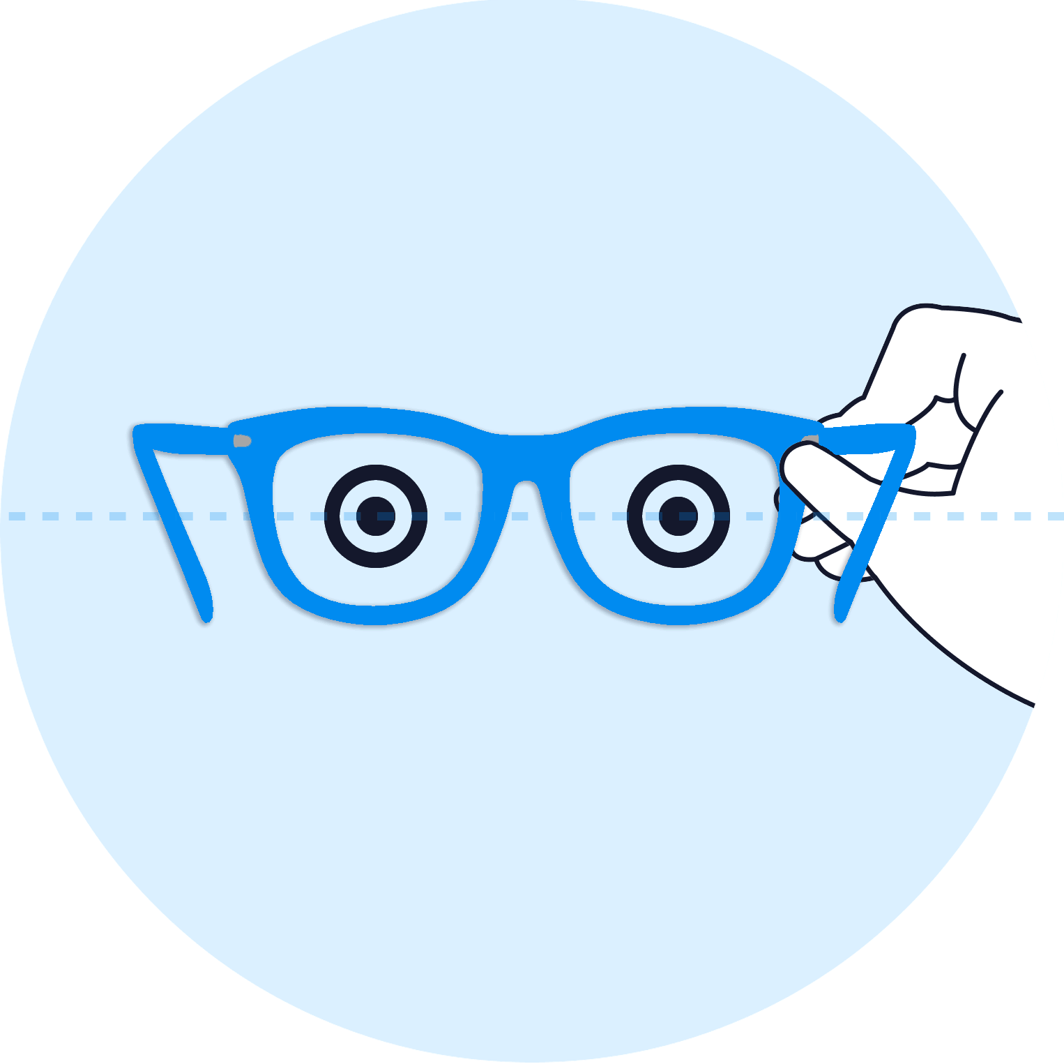
The app simplifies getting a new prescription. Users can simply scan their existing lenses to extract their parameters and start shopping online. To ensure accuracy, the app guides users through a straightforward process: placing their phone in front of their computer, positioning their glasses between them, and tilting them up and down.
2.0 Version
The app's user experience needs a major overhaul. Many users find it too long and confusing. We can leverage new tech to streamline the process, make it device-friendly, and provide real-time feedback.
Workout
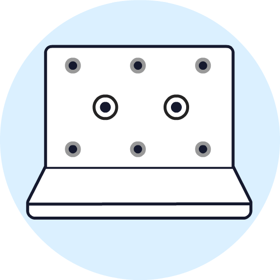
The workout pose is challenging to explain. We've redesigned the instructions for clarity and ease of use, breaking it down into simple steps.
Overall effort
The app is technologically very complex, requiring the cooperation of all company departments to get this project off the ground. At the same time, we need to ensure it is suitable for users of all ages and available in multiple languages, which is no simple task.
![phone_14_01 [Converted]-01.png](https://static.wixstatic.com/media/ceedc7_9f87b396a1044853ba47fe218cb4a170~mv2.png/v1/fill/w_638,h_638,al_c,q_90,usm_0.66_1.00_0.01,enc_avif,quality_auto/phone_14_01%20%5BConverted%5D-01.png)

To make the user experience more user-friendly, we divided the onboarding process into a three-part carousel, giving the user time to properly organize themselves.


For the sections involving phone placement, glasses positioning, and tilting the glasses up and down - areas where we saw users struggling - we added detailed animations so that users only need to mimic what they see. The animations were created using Blender, a software I learned specifically for this purpose.


Thanks to new technologies, we had the opportunity to significantly enhance the user experience. The new design perfectly captured these improvements, resulting in a more intuitive and faster app.